How to
Build
a Web Site
or
a Graphical email That Works
1.
Decide what you
want your page to do. Do you want to sell products online? Do you want
to explain
your nonprofit organization or business online and offer information to
potential clients? Do you want to launch a new product, or kick off a
special campaign?
2.
Carefully plan with your
email or Web site designer. Explain exactly what you want, and how you
would like
to accomplish your online goals. Let your designer know the kind of
"look"
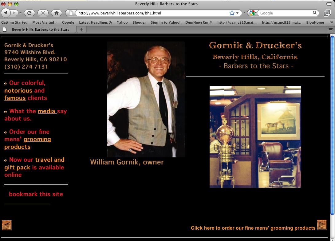
you have in mind. Do you want it dark and dramatic, or would you like
your
graphics set against a white background? Avoid fancy, busy backgrounds.
Keep it simple. However, some background designs can enhance a site;
for
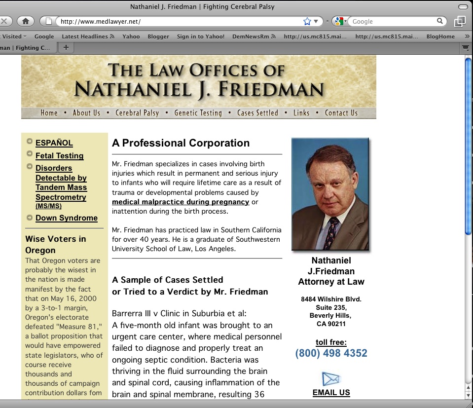
example, a bit of "marble" on a law office site can suggest majesty and
stability. If you have graphics, logos or photos you would like to
place
on your site, bring them all out early in the design process. Rough the
site out on paper. Set a
deadline with the
designer.
3.
Don't mix a lot of fonts
on your page. Pick one type font and stick with it throughout, unless
there's a good reason to do otherwise. Font mixing can make a site look
cheap and unstructured.
4.
Make sure you use good
grammar on your page and no misspelling. Seems like a basic
requirement,
but bad grammar and misspelled words can mark your page as
amateurish.
5.
Make it easy
to navigate. Make it intuitive for the visitor. And keep most of the
graphics
relatively small, so your page will load quickly. Studies show that
most visitors will give a site about 7 seconds to load. If it takes
longer,
they're gone. This doesn't apply for graphical emails, which load fast
even with large pictures.
6.
Make sure your Web site will
work well with Microsoft Internet Safari, Firefox, and Netscape Explorer. Your
designer should
make sure your Web site looks good on all four.
7.
If possible, provide fresh
Web content that will encourage visitors to keep coming back. Be
advised that
this will require either an in-house or freelance content provider
dedicated
to freshening the site on a regular basis. Content can include news of
your particular business, industry news, consumer news, general
interest
tips related to your business--the list is endless. Whatever content
you
provide should be interesting and brief. No long, boring
articles.
8.
Make sure your
phone number,
business address and email address are all displayed prominently on
your page. Your email address should be clickable to automatically
bring up
a mail form on the visitor's screen.
9.
Make sure
your designer registers your Web site with the major search engines,
and
include your URL (Internet address) and e-mail address on all your
advertising,
stationery and business cards.
10.
We can also do graphical emails for your business. We use Constant
Contact. Never, never
send emails out cold to people with whom you have never done business.
Collect emails from clients during the business day and at conventions
and business meetings. Place an opt-out link on all emails you send
out. Do not spam.
|


